


Cumulative Flow Diagram (CFD)

Last week, a developer told me a story from his team: “A task was delayed because it was too big, and after two days of delay, my client asked me when it would be ready, and I told him on Tuesday.” . This conversation was on Wednesday and the task was not yet ready.
Are you familiar with this scenario?
I told him: if you are responsible for telling your client when a task will be completed, then you are the leader of your team. Relucting, he agreed. My next question:
Do you have data for your team to estimate something, or you just using your intution? If you are using your intuition you should have told your client: Probably Friday, but to put it in production, only on next Monday. =D (Fun fact: He told me that this was a good estimation in the end).
I showed him my CFD. I’m keeping tracking of my tasks in my current work. We “use” SCRUM, so this is only for my personal experience - or not, as we will see here.
Extracted from Essential Kanban Condensed from David Anderson, a Cumulative Flow Diagram (CFD) is a chart showing the cumulative number of arrivals and departures from a process, or parts of a process, over a time period.
If you are a Jira user, Atlassian defines CFD as an area chart that shows the various statuses of work items for an application, version, or sprint. The horizontal x-axis in a CFD indicates time, and the vertical y-axis indicates cards (issues). Each colored area of the chart equates to a workflow status (i.e. a column on your board).
Each area of the graph represents a different status:
Backlog
To Do
In Progress
QA
Done
This list is not exhaustive, and you can customize the CFD to include additional statuses to reflect your team’s workflow.
In my case, I use : Backlog - To Do, In Progress, Review, Done.
Using/Reading a CFD
Let’s talk about the 3 key metrics that you can get from a CFD:
Throughput: The number of work items completed over a period of time. This is the area under the “Done” line.
Cycle Time: The average time it takes for a work item to be completed.
Work in Progress (WIP): The number of work items that are in progress at a given time. This is the area between the “To Do” and “Done” lines.
We want to increase throughput and decrease cycle time. One way to do this is to reduce WIP.
Let’s see a real CFD
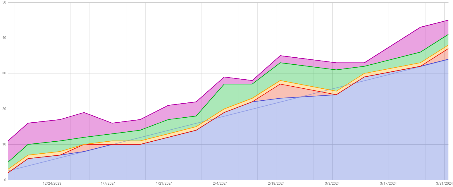
Purple - Backlog
Green - Todo
Yellow - In Progress
Red - Review
Blue - Done
What can we learn from this chart?
When the red area increases, we have tasks in review ( maybe for too long). Do you need to review you code review process?
I have a good backlog and Todo queues, so this never created a problem to not have a next task to work.
My “In Progress” is constant 1. I try to not start other tasks in parallel. This happens sometimes, and we just put our ticket in To Do again. It can mask here, but it’s not a problem in our company, so it’s ok.
There are a lot of other informations that we can take here, but let’s go back to the developer use case: I can use that blue line to estimate how many tasks will be delivered in a future date. Just keep increasing the graphic to the right. Imagine now this is your team CFD. So you can have data to give a better estimation for your client: remember, it’s an estimation - it can still be wrong - but look how different is the conversation with the client: “Hey, our team is delivering a big feature for you in 10 days, so I can only delivery this after 10 days. What do you think?”
This is a nice way to convince, don’t you agree?
I hope you can use data to help you understand better your deliveries.
Give me a reply if you are interested in learn how to build your CFD.
Happy coding!